
From Overhaul to Engagement: IIDA NPC’s Digital Transformation with Tano Design
Over the course of eight months, Tano Design had the pleasure of working closely with the International Interior Design Association Northern Pacific Chapter (IIDA NPC) to breathe new life into their digital presence. This project was packed with exciting challenges: a patron drive, redesigning 33 website pages, working with 12 committees, and rolling out fresh branding for 4 four signature events and one icon event. We also created the president’s theme—complete with new templates, colors, and fonts for each presidential term—plus social media planning, newsletter template updates, and even Graphic Design 101 training with the committees. In result, we achieved a fully transformed digital presence for IIDA NPC, improving accessibility, engagement, and ease of use across their website, events, and communications.

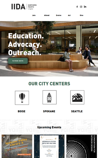
IIDA NPC, a non-profit organization with over 400 members, is all about community and advocating for the professional legislation of commercial interior designers. But their website? Well, let’s just say it needed a serious facelift. Finding events or information was a bit of a treasure hunt! So, we tackled a full overhaul, updating everything to make it dynamic, relevant, and easy to navigate, complete with calls to action, optimized SEO, and WCAG 2.1 AA-level accessibility. We streamlined event sales directly on the website (no more third-party hassles!), and each committee got hands-on training to manage their events—from ticket sales to attendee check-ins and more. Their digital meeting software was integrated seamlessly, making event planning a breeze. Since launching the new site, there’s been a 124% increase in site sessions and a 53% rise in unique visitors— a tremendous win!

Next up was the patron package. It was a bit of a puzzle, so we brainstormed, designed several new layouts, and made it more user-friendly. Now, it’s easy to read, navigate, and features statements from each of the committees with a thank you to the previous year’s patrons, ensuring everyone feels valued and their investment is clear.

When it came to signature events, we were in our element! These events are the showstoppers that draw the biggest crowds:
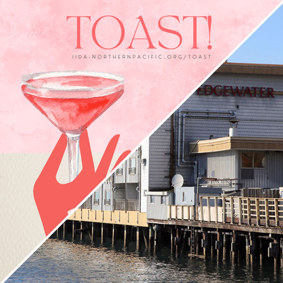
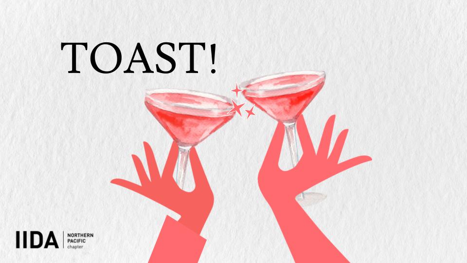
Toast!: Celebrating standout community members in an awards show with a fresh logo, signage, slide deck, physical awards, and digital ads.
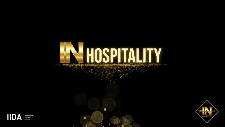
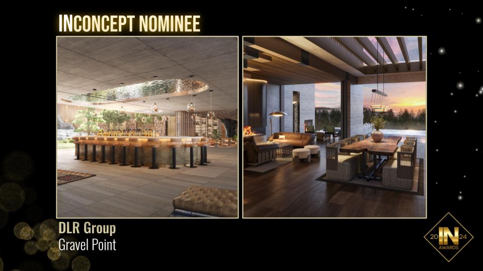
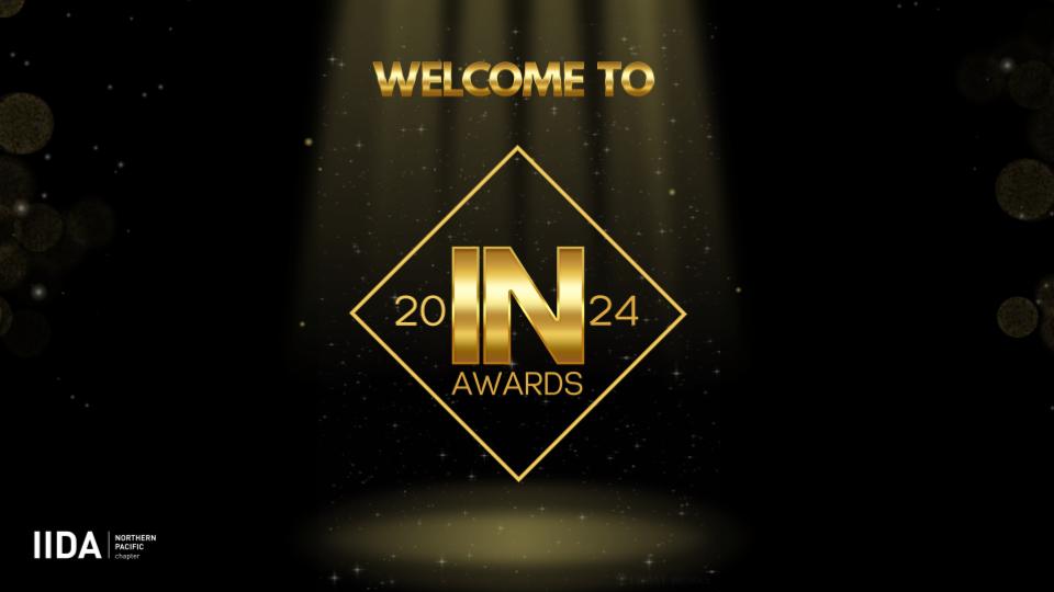
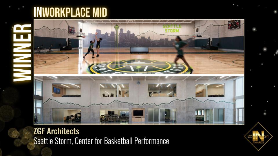
INawards: Showcasing the art and skill of commercial interior design in a project specific awards show, we developed a new logo, signage, slide deck, awards, seat charts, table settings, and digital promotions.
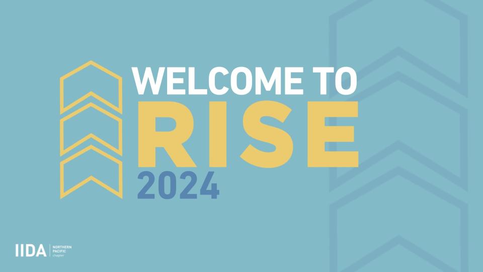
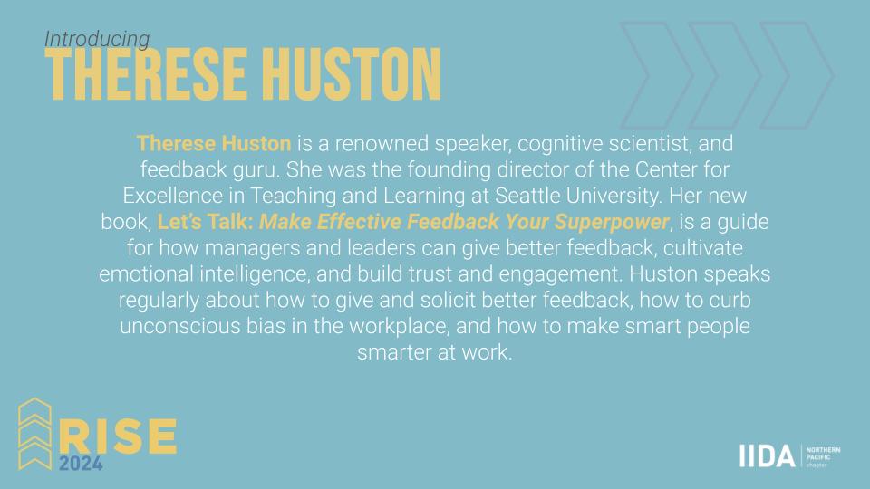
RISE: Our keynote speaker event featuring knowledge-sharing over breakfast, complete with a logo facelift, signage, and digital assets.
Product Runway: This high-fashion event brings manufacturers and interior designers together. We designed everything from logos and signage to a looping video animation, live-view overlay, and more.

Social media also got a major refresh. The chapter had been using one static template for all events, regardless of type or audience. We organized all 150+ events and created 10 custom templates that could highlight any of these events without it looking too repetitive. These changes, paired with brand training and simplified approval processes, have been a game-changer. Since launching, we’ve seen over 70 new followers, a 283% increase in content engagement and reach has grown by 27% on Facebook. There has been a 56% increase in reach on Instagram and a 100% increase in content interactions along with over 200 new followers. Finally on LinkedIn, there have been over 150 new followers, a 341% increase in impressions and a 200% increase in engagement.
Additionally, we created handy video tutorials to walk board members through the changes, making them self-sufficient. The videos, along with several one-hour training sessions at an hour long each have allowed this non-profit to keep their budget while maintaining a “Graphic Designers” level of imagery.

And let’s not forget the newsletter! It was packed with too much information, and data showed that people weren’t scrolling far enough to see it all. After analyzing the data, we designed a more condensed version with clickable icons leading to each committee’s dedicated page. The result? A 101% increase in website visits from the newsletter.
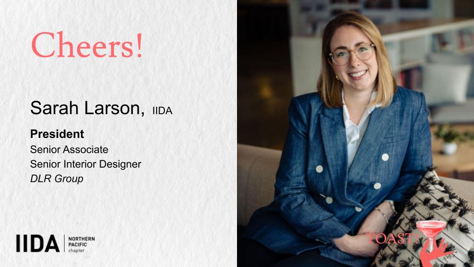
"Sarah Tano, our 23-24 VP of Communications on the IIDA board and owner of Tano Design, has done an exceptional job revitalizing our chapter's brand and communications. She brought a fresh, cohesive vision to our messaging, making it clear and impactful across all platforms. Sarah's dedication to re-establishing our brand identity has helped us connect with our members on a deeper level, showcasing the value and vibrancy of our design community. Her innovative approach and strategic thinking have transformed the way we communicate, making our chapter's voice stronger and more engaging. Thanks to Sarah's efforts, our communications are now more professional, dynamic, and truly reflective of the IIDA's mission." - Sarah Larson, 23-24 IIDA NPC President
This transformation wouldn’t have been possible without the amazing support and collaboration from IIDA NPC and their executive board.
























Comments